PatsFans.com Menu
PatsFans.com - The Hub For New England Patriots Fans

Opinions regarding our team logo


Status
Not open for further replies.
Honestly I don't like either one. Pat is about as interesting as the winking Buccanneer, which was a bad joke. it's too complicated to be a useful modern logo. The Flying Elvis isn't really any better, but neither the Elvis or the Pat is really an option to me.

I think we need to divorce the Patriots from the Revolutionary War era. Patriotism transcends era after all.

Personally I favor using something very similar to the US roundel.

File:US Roundel 1943-1943 No Outline.svg - Wikimedia Commons

Start with something like that, and find a way to make it our own. Use it to honor the troops of all eras rather than call back to a war over two centuries ago.

I dunno, that's just what I'd do.

I'd much rather it be some cute history thing than a military endorsement.
 
The Patriots are not named to honor the military, they are named to honor the founding of this great country and all it has stood for - which is very tied up in the Revolutionary War - which began in ...... New England (Boston to be specific).
 
It's interesting to take a fresh eyes approach to these logos and the truth is many of the bottom 20 or so are just stupid ,bad and ugly..

Oh, and there is this:

16. New York Jets
There's a fine line between simplicity and boredom. The Jets are way beyond that line. While the green oval, outlined "NY," italicized "JETS," and football underneath is a good look, being named after an airplane allows for so many logo possibilities like, um, an airplane.
 
My condolences.


The good news is that you've at least got the SB wins to help take your mind off the terrible logo and uniforms.
I'm sure some folks dislike AC Milan's uniforms as well. Indeed, I'll let the Super Bowl wins and greatest football dynasty of all time distract me from my short-sightedness.
 
It doesn't matter at this point because one logo is almost exclusively associated with a successful franchise that has dominated the sport and constantly been in Super Bowls since it was adopted and the other (and part of this is compounded by the hindsight of modern success) is associated with a franchise that many considered to be a joke the entire time it was in place.

They aren't going to risk going back now. Especially being towards the end of the tail end of the Brady era where it's entirely possible they hit some growing pains upon the adoption of an older logo. Timing is everything and the Flying Elvis had great timing. And honestly, aside from some hardcore fans, nobody cares about this debate all that passionately.
 
Pat............ is too complicated to be a useful modern logo.
Bingo!
I loved Pat......it was a very clever and detailed animation that combined the historic significance of the region with football.
The problem with Pat was that from a distance, the detail within the logo got lost and the image turned into a blur....which was a failure of purpose....as a team identifier....and a branding instrument
upload_2018-5-15_5-59-4.png
 
Last edited:
In other logo, mascot news....this just in. T-Rex swallowed a cheerleader on the 50 yard line. The hungry mascot swallowed her in 2 bites just before washing her down with an ice cold silver bullet. We will return to the riveting logo talk after these words from Rolaids...

best-mascot-t-rac-swallowing-cheerleader_pg_600.jpg
 
Last edited:
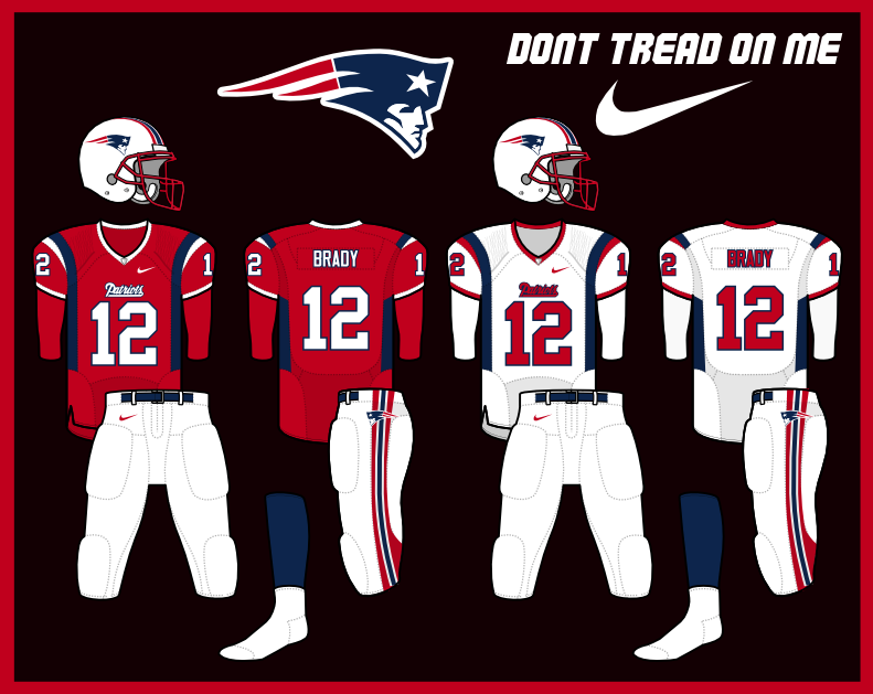
I'm probably the only one that wants the red jerseys back with Elvis.
images

NewEngland.png


Although the blue stripe down the side... yuck.
 
I'm probably the only one that wants the red jerseys back with Elvis.
images

NewEngland.png


Although the blue stripe down the side... yuck.
Nope, you're not - I've always said I would love this uniform.
 
I'm probably the only one that wants the red jerseys back with Elvis.
images

NewEngland.png


Although the blue stripe down the side... yuck.
I want to see them do throwback uni with the 90s colors. TB12 in the Bledsoe Blues.
Bledsoe_Drew_Patriots.jpg
 
Bingo!
I loved Pat......it was a very clever and detailed animation that combined the historic significance of the region with football.
The problem with Pat was that from a distance, the detail within the logo got lost and the image turned into a blur....which was a failure of purpose....as a team identifier....and a branding instrument
View attachment 20393
Yes, the Elvis, for all its faults, IS a much more distinct logo, that you can identify at a distance. I think it needs to be replaced, but disregarding the aesthetics, it is much better as a logo than Pat is.
 
I want to see them do throwback uni with the 90s colors. TB12 in the Bledsoe Blues.
Bledsoe_Drew_Patriots.jpg

Uggh, that thing was hideous. Maybe shrink the size of the Elvis to about 1/3 that size and shift it down to the upper arm, and you have something to work with. Or remove the shoulder logos entirely. It might be a decent uni without the Elvis on the shoulder.
 
Sounds like we need a poll :D (not that it will change anything)
 
I want to see them do throwback uni with the 90s colors. TB12 in the Bledsoe Blues.
Bledsoe_Drew_Patriots.jpg
That one is pretty bad. But the one's from his rookie year are the worst.
98820183750be3686f1d8f946ccfb549.jpg
 
Most teams who change logos/uniforms end up with worse. In fact most of my favorite uniforms are probably the ones that have mostly stayed the same i.e packers, raiders, cowboys.
 
Critiquing logos is a loser's mentality.
 
The Dallas Cowboys
2-14 twice team
The San Francisco 49ers
the guy taking a dump
So that's what all those guys are doing at the start of every play from the line of scrimmage...
the logo of futility
upload_2018-5-15_12-41-52.pngThe media love to propagate the team's "futility", like in 1981...no one ever mentions that was the single losing season in a stretch of 13 years...meanwhile, the Packers did zero for 25 years between Lombardi and Favre, and the Giants were by far the worst team in football in the 70's, etc.


100px-New_England_Patriots_logo.svg.png
THIS is the logo representing the futility of debunking all the media, league, and opponents' B.S. regarding the Patriots and expecting them to ever admit their ignorance and stupidity, let alone stop making statements as "fact" which are preposterous
 
Status
Not open for further replies.


Thursday Patriots Notebook 4/25: News and Notes
Patriots Kraft ‘Involved’ In Decision Making?  Zolak Says That’s Not the Case
MORSE: Final First Round Patriots Mock Draft
Slow Starts: Stark Contrast as Patriots Ponder Which Top QB To Draft
Wednesday Patriots Notebook 4/24: News and Notes
Tuesday Patriots Notebook 4/23: News and Notes
MORSE: Final 7 Round Patriots Mock Draft, Matthew Slater News
Bruschi’s Proudest Moment: Former LB Speaks to MusketFire’s Marshall in Recent Interview
Monday Patriots Notebook 4/22: News and Notes
Patriots News 4-21, Kraft-Belichick, A.J. Brown Trade?
Back
Top