Chris Chase of USA Today has managed to be wrong about design, local touchstones, and the general success of a brand all at once. To wit:
Despite the silver-faced John Kerry
Wrong. He is a Lost-in-Space android version of the Man in the Mountain, a beloved 60s TV show and a beloved regional landmark combined. And by the way, the android I mean intones "Crush, kill, destroy," not "Danger Will Robinson." If you still cannot place the android I cannot talk to you any further.
the Pats logo at least kept red, white and blue in the color scheme. And that's the only positive thing that can be said of the Flying Elvis design. Don't be fooled into thinking it's good just because the Patriots are.
And don't be fooled into thinking it's bad just because the Patriots aren't. There's a loyal "isn't outdated cool" contingent. But most have embraced their Flying Elvis gear, yours truly included. If you have the cash for one stitched-numbers jersey, its almost certainly going to be the white or navy Flying Elvis on the Shoulder version. It's not going to be the throwback. Flying Elvis is Patriots gear. Pat Patriot is what the gear would look like if we used the old logo with new player names.
This logo is all horrendous. The Jay Leno chin? The trailing red lines of the helmet? The white star that is supposed to represent the flag but looks like the world’s most unfortunate birthmark? Awful. This has been called the Flying Elvis logo, but a flying Elvis would be infinitely cooler.
The specifics here are a little comical but mainly stupid. The star does recall the flag, the Jay Leno chin is again based on a known profile.
The trailing red lines establish motion, something you dont get from a cartoon ethnic stereotype center who, from a distance, could be confused for a Houston oilers oil derrick. You ever confuse the flying elvis for ANYTHING?
Now, let's go to what a real designer would talk about, the design element of the curvy elvis wedge--a fat-side-front, rough triangle with implied forward motion. Who did it first? I think the Flying Elvis, though I'm not sure. Here are teams that sport it now:
Us (yay.)
The Carolina Panthers
The Jaguars. By the way, you think you've got problems? That Jaguar drank a blueberry icee before the game. Look at that tongue.
Houston Texans.
Arguably Atlanta.
Variant, thick edge back, with the emphasis still on forward motion: Denver cyberhorse.
Arguably the Flaming Thumbtack (they moved in 97, so I'm calling it derivative to the extent that it recalls the wedge; but I really think it's circular with a flourish to add motion.)
Flying Elvis is unmistakably a period warrior, with 90s, not 60s, presentation. The 60s version had no motion, was not intimidating in the least (more like laughable), and worst of all, could not be seen clearly from any distance. It was a good logo to print in a single-panel cartoon, oh wait, that's what it actually was.
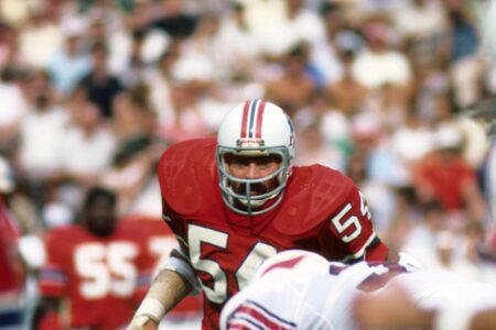
The Patriots had once before tried to replace the famed Pat Patriot logo, partially because there was so many intricacies in the design (13 shirt wrinkles and small facial features) that it was hard to reproduce on various retail items.* Fans booed the new logo (an American flag replica with a blue patriot’s head instead of stars) so badly that it was never adopted. In 1993, the Patriots went with a new look, abandoning the red, white and blue color scheme for the current Flying Elvis logo with a silver background. This time they wisely didn’t give fans a chance to boo.
APF's favorite only tangentially related story! Yay! It made USA Today! Don't care. Not the same logo. Not the same reaction. Shut up.
How bad is the logo? The jerseys or logos of great teams will, over time, eventually come to possess their own power. The Golden State Warriors logo is great but it didn’t have that inherent strength until the team had it too. The Pats have been the NFL’s preeminent team for close to 20 years and this logo looks as stupid today as the day it was unveiled.
Spoken like a Jets fan. Just go embrace what you
really want to be. A nice clean, wait while I laugh, WORD as a design element, with only slight tweaks on the logo since the 60s (not to say there weren't tweaks by fans and draft pick presenters - JEST, JETE...)
Whenever I see these complaints it's like seeing a guy who's p.o.'d that the Pats coaches are using those Surface tablets on the sideline, even though they think a big thick xeroxed playbook is better, or that a well-handled abacus has superior computing power. No.
The old logo is not just
the old logo, it's also
an old logo. It comes from the days when somebody could know somebody and that guy could scribble **** on a napkin, and that **** could be repurposed from cartoon to brand, and because it's the only game in town, people could get behind it. Gee our old LaSalle ran great, right? Well I ain't havin' it.
Let me give you a living example (which Pat Patriot is emphatically
not.) Fenway Park is a "lyric little bandbox of a ball park" or something, right? Well they built a damn door into the left field side wall, they didn't have room for a proper left field to begin with so they made a gigantic wall, you have to play it radically different from any other left field in the majors, and you had to change the angle you're trying to hit the ball if you're trying to go yard.
Now don't ask yourself if it's good or bad, I think it's
great. more character than any other park in the majors. Everybody could picture it just from those few facts above. the only thing close to that much character is that there happens to be some ivy at Wrigley.
That said: If the unthinkable happened and they built a new park for the Red Sox -- you know, a real modern-day masterpiece... would they make the porch that short in left? Would they compensate with a 40 foot wall? Would they build a goddam DOOR in the side? Hell, other teams might sue.
I remember some time ago they were planning to build a new Fenway and make it just like the old fenway or something... I wonder if they were planning to build a door into the side.
Anyway, if you did it would be pure nostalgia. You would not have reproduced the imperfections of life that led to that endearing mistake. Let's face it, if a door in the side was good for the game, every ball park would have a door the ball could bounce around in.
It's a quirk.
So is the cartoon center. It's not design for a purpose.
Don't assume that you couldn't sell Pat Patriot gear just because the team wasn't
as good. (They weren't the doormat this writer pretends they were either... although they were certainly nothing like the Flying Elvi.)
To sum up, stop being wrong on my internet.