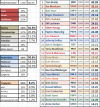
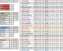
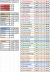
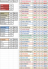
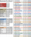
Update: I have an alternative color scheme based on team uniforms (it wasn't that difficult to enter the RGB codes into Excel, and it automatically applies that format to the row based on the team uniform you specify). There's the option to use the other one scheme as well, if htis one is too bright and busy. I'm hoping this will make it a little easier to follow the numbers across the rows. I was about to go a step further and show the total score, followed by the three index scores, neatly next to each other as a nice overview of the player. That's when my old, trust friend Excel 2010 had enough of my excessive conditional formatting (jersey colors) and decided to crash every time I try to add a new column now.
But it pushed me forward to the first step of uploading to Google Sheets, so I'm in the process of fixing some conversion problems, on track though to make it shareable as soon as it works. The adjustable controls need to be a lot more intuitive and offer some explanation tot.
Let me know what you think of this color scheme...I don't know if it's too bright. I tried like five dfiferent combinations (one had a variation of light and dark jersey styles, but dark backgrounds never work well with spreasheets and data.)
The other thing is, when you look at all the controls, adjustments scores, it's very hard to comprehend what's happening. So, I need to make it a lot easier to see what's happening with these parameters.
One thing I'd like to do is tie it to a percentage, so you know if you're cranking up the relative strength of championships, or passer rating, it's X% of the total point calculation based on the entire population. So if you want to double how much peak performance is worth, maybe it's going from 5% of the total to 10%. A pie chart would really come in handy here, so that you can see what an impact it's making rather than just adjusting something from 60% to 80% with no idea what impact it's making. I'd love to be able to show the relative points/ ranking changes based on your adjustments with a green/red points indicator...you'd be able to see which playes are moving up or down based on the changes, and then when you press update, the rankings will update again and you can then adjust again.
Finally, you'll notice that Brady is at 49.99 points; I've actually made that the max, so that if a player exceeds 49.99, a percentage is applied to the raw total to keep it at 49.99 and no higher; that gets applied proportionately to every player. This way, we'll have some consistency. If you jack up a setting so that you get 100 points for an MVP award, it's giong to bring that down to scale, so it will help relative to other players who don't have as many MVP awards (extreme in this case), but you'll still see all player scores between 0-49.99. This way, everyone's rankings can be scaled and compared to each other.
Also disclaimer
@Deus Irae ... these are not updated rankings, just format I think it”s actually missing some formulas so is particularly off right now.