- Joined
- Sep 13, 2004
- Messages
- 73,353
- Reaction score
- 22,971
Not true. Most fans don’t care.99 percent of fans hste it they look like clowns blue and silver are the way to go
Registered Members experience this forum ad and noise-free.
CLICK HERE to Register for a free account and login for a smoother ad-free experience. It's easy, and only takes a few moments.Not true. Most fans don’t care.99 percent of fans hste it they look like clowns blue and silver are the way to go
Literally this.Not true. Most fans don’t care.
99 percent of fans hste it
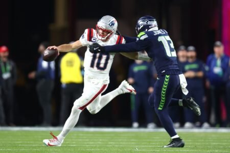
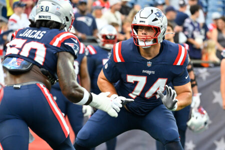
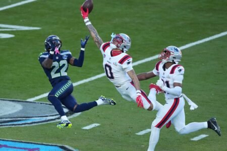
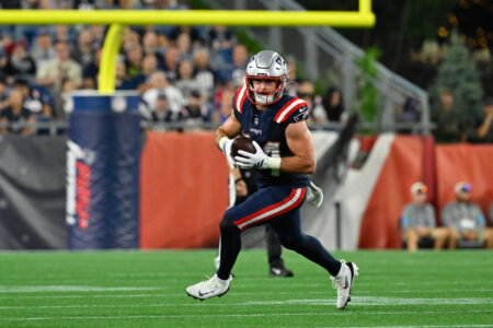
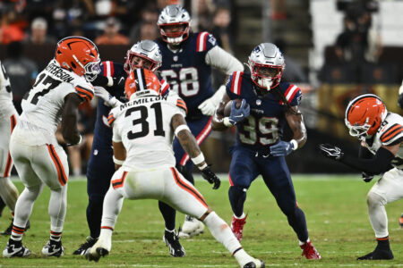
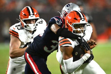
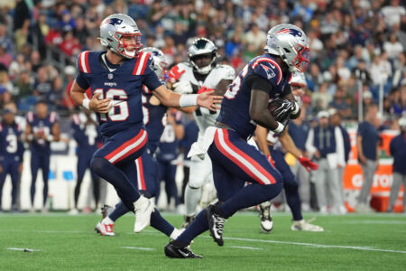
I don't like the all blue "color rush" uniform.Can some one help who decides this god awful combo !??? Hopefully it’s just pre season but this combo is god awful the last two years they improved with the silver and the rivalry uniform is sweet … But for gods sake stop the blue on blue look who makes these calls … how bout listen to the fans truth be told the uniform needs tweaking then full reboot but please stop
I don't like the all blue "color rush" uniform.
Hey that's Fitzi from the "leave Bellichick alone" era 2007?I don't like the all blue "color rush" uniform.
The logo is outdated considering that the Old Man of the mountain is no more.
The color rush across the NFL generally suck.I don't like the all blue "color rush" uniform.
(Looks like ChatGPT was hallucinating for him again).
Losers must stick together.(Looks like ChatGPT was hallucinating for him again).
We should all admit that the Pats and Bills look more like each other than we look like other eras of our own uniforms, setting helmets aside. They're just really similar palettes.IDK - these jerseys felt more like a darker blue take on the Bills' uniforms at one point than Patriots' uniforms.
We should have stayed with the Brady era uniforms. Maybe some small changes here, but you have a one in several lifetimes run of success you should enshrine that in every way possible. If the Steelers can use the same basic **** year in and year out why not us?
First of all, I've heard forever that blueberries are good for you, and I really like them, so stopping them would take an adjustment.
As he says, Bob Kraft is in charge. It's his show since 1994. Mostly totally awesome stuff, but also some really ugly crap too. Did you see what they just did to the Revs? Original established iconic good looking sport appropriate logo, been to at least 3 or 4 MLS finals. Trashed and replaced by another really disturbing atrocity created in, of all places, London.
There's a lot behind local fans being behind the flying elvis. Justified anger at Billy Sullivan, and being brainwashed by local media into believing the false laughingstock narrative, to name two.
The solid color scheme is clownish and embarrassing at any level of the game. Film and photos of how old generations looked when they played inspires envy today, that men could hold their heads high and be proud of their team. The pride of the Patriots since '93 has been forced to be strictly within the team, in spite of what they've been forced to wear.
Bob Kraft is really good at a lot of things; sports team logos and uniforms is not one of them.

| 34 | 7K |
| 34 | 7K |
| 82 | 14K |
| 22 | 5K |
From our archive - this week all-time:
August 16 - August 31 (Through 26yrs)