Patsfan1645
2nd Team Getting Their First Start
- Joined
- Jan 5, 2013
- Messages
- 1,566
- Reaction score
- 3,066
Registered Members experience this forum ad and noise-free.
CLICK HERE to Register for a free account and login for a smoother ad-free experience. It's easy, and only takes a few moments.MassLive | Posted: 06/20 New! |
| Former Patriots star Rob Gronkowski attends Scotland-Morocco, has favorite Euro star |
The Athletic | Posted: 06/20 New! |
| Want to keep the Boston-Scotland party going? Get the New England Patriots involved |
MassLive | Posted: 06/19 New! |
| How to extend Boston’s bond with the Tartan Army on Scottish soil |
MassLive | Posted: 06/19 👁: 66 |
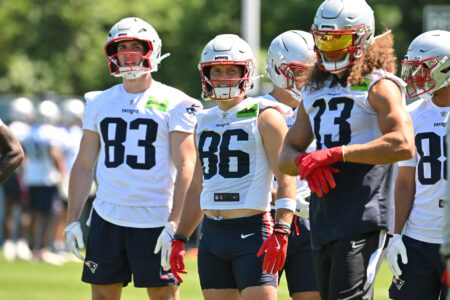
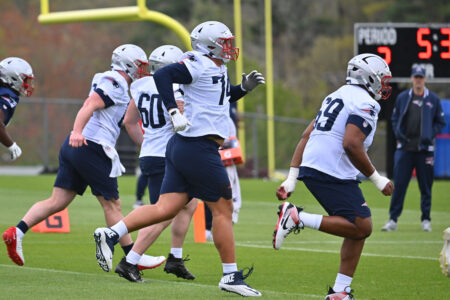
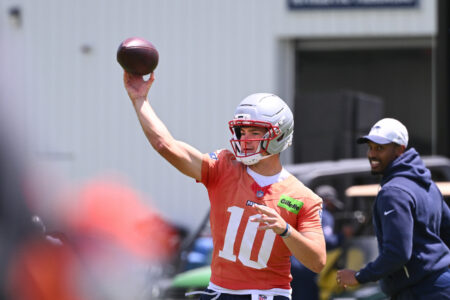
| Patriots undrafted rookie tight end hopes to turn more heads in training camp |
Boston.com | Posted: 06/19 New! |
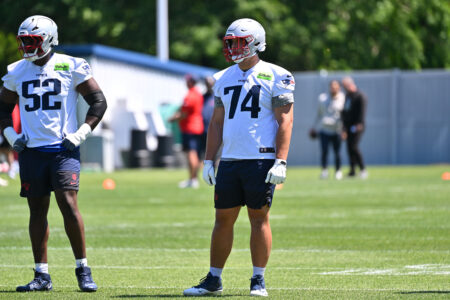
| Patriots 2026 position preview: Defensive backs edition |
| Happy 26th Anniversary to Pats Fans 3 Reactions | 06/20 at 8:36 am |
| OT: The 2026 World Cup Thread 3 Reactions | 06/20 at 11:22 am |
| TODAY'S TOP POSTERS: | # | |
| jmt57 | 13 posts | |
| Wozzy | 9 posts | |
| Bill Lee | 8 posts | |
| Triumph | 6 posts | |
| Huckleberry1 | 4 posts |
From our archive - this week all-time:
June 5 - June 20 (Through 26yrs)