

PatsFans.com Menu
PatsFans.com - The Hub For New England Patriots Fans

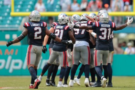
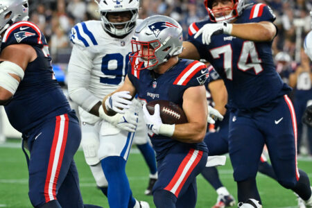
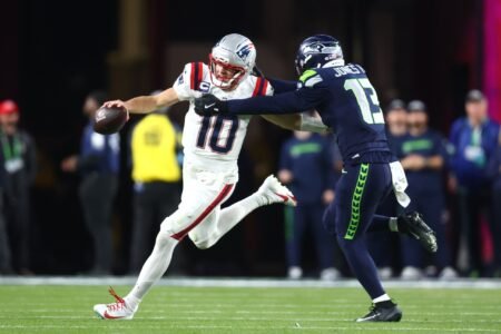
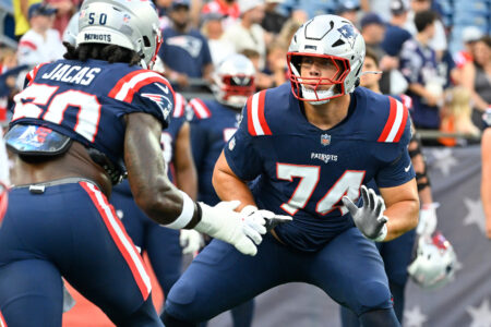
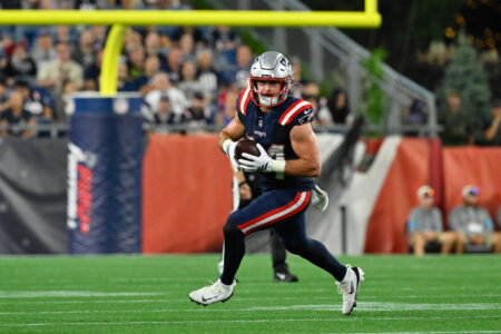
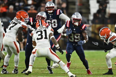
Debut of the Nor'easters

Next Opp: TBD

Do you like the Nor'easter Unis?

  • Yes

    Votes: 44 44.4%
  • No

    Votes: 17 17.2%
  • Meh

    Votes: 19 19.2%
  • This post is stupid no one cares

    Votes: 3 3.0%
  • RLKAG

    Votes: 16 16.2%

  • Total voters
    99
Status
Not open for further replies.
Should have used the moniker Nor Wester because of La Nina.


Nor'easters come from NORTHEAST WINDS, genius. And even a weak La Nina can increase their frequency.

The collective IQ of this board just dropped by 12 points. Please stop posting.

 
Last edited:
I really like them. Also liked the matte FE on the helmets. Think I'm going to buy.
 
Didn't love em, didn't hate em. I mean anything is better than the unis the fudge packers wore vs the Panthers, and yeah I get they're throwbacks but some things are better left in the past.

 
Never understood the passion about uniforms, in this case it is nothing more than a "cash grab" so the NFL to sell more jerseys and related clothing...
$189 for a genuine Nike Storm blue Patriots jersey, you gotta be kidding me..
 
Yes they are

However from a distance they do look like the Colts
To me they looked a lot grayer than the Colts or Titans. There were a couple times when I was looking at my TV and I was wondering why my TV was showing the game in black and white.
 
Unlike Buffalo, we won with them. They are okay, but I still think they look like somebody washed the Colts jerseys with a bit too much bleach.
 
To me they looked a lot grayer than the Colts or Titans. There were a couple times when I was looking at my TV and I was wondering why my TV was showing the game in black and white.
I have one.
Definitely greyish blue.
Nothing like Colts, Miami, Titans, Tar Heels or any other blue they have been compared to on this thread.
 
I have one.
Definitely greyish blue.
Nothing like Colts, Miami, Titans, Tar Heels or any other blue they have been compared to on this thread.
Agreed on the color. I think one thing throwing people off is it seems like the color is a little different in every photo or video, so sometimes they appear more blue and sometimes more gray.
 
I love the design except for one thing, the primary color being so gray rather than a Patriots brighter or darker blue. Yes, some pictures have it less gray-ish. Even close up in postgame interviews on TV somehow it didn't look as gray.

Positives: the white numbers, the white pants, the pants stripes, the uniform stripes, the NE logo on the shoulders, the red championship stars... all awesome!
 
Don't like it. I don't have an issue with the design (stripes, numbers, etc.), just don't like the faded look. It's like something that was laundered a million times and left in the dessert sun to fade. No pop whatsoever. The helmets too... Plain white... looks like they came out of the box and they slapped Elvis on them.
 
These were way better than the primary uniforms. I really hope the Pats have been working on new uniforms for 2026. I can't take those uniforms any longer. Does anybody know why they switched in 2000 when the Pats popularity with the 90's was at it's peak at that time?
 
Don't like it. I don't have an issue with the design (stripes, numbers, etc.), just don't like the faded look. It's like something that was laundered a million times and left in the dessert sun to fade. No pop whatsoever. The helmets too... Plain white... looks like they came out of the box and they slapped Elvis on them.
I'm not crazy about the helmet--I don't like the flying Elvis without the red--but my kid said she liked them because they looked like they were frosted over with ice, which I did kind of like.
 
Didn't love em, didn't hate em. I mean anything is better than the unis the fudge packers wore vs the Panthers, and yeah I get they're throwbacks but some things are better left in the past.

I'm still waiting for that one star player to step up and tell management that they aren't that ****.
 
Give me the same design with fully saturated colors. We literally turned up the brightness on our tv because the gray uniforms and night lighting made the whole game look dim and faded.
Yeah, this design with normal blues and reds would look awesome. So much better than the ones we've got now.
 
Give me the same design with fully saturated colors. We literally turned up the brightness on our tv because the gray uniforms and night lighting made the whole game look dim and faded.

So the whole game looked rather like the JETE's hopes and dreams?
Kinda fitting when you think about it...
 
Last edited:
Status
Not open for further replies.

PatsFans.com LinkHub

𝕏 / Tweet
twitter.com
Uncategorized
twitter.com · by Uptown
1h
📰 Article
youtube.com
Uncategorized
youtube.com · by One-If-By-Sea
4d
📰 Article
youtube.com
Uncategorized
youtube.com · by Clonamery
6d
𝕏 / Tweet
X.com: Schefter on Giants Offer For Cam Ward
twitter.com · by Uptown
13d
𝕏 / Tweet
Post from @NFL on X: Drake Maye No. 11 on the NFL Top 100 of 2026
Patriots Videos
x.com · by Ian
15d
REISS: How will the Patriots respond in 2026 to the Super Bowl loss?
Interesting Article (Sports)
espn.com · by Ian
16d
𝕏 / Tweet
X.com: 2026 Patriots Day 1 Joint Practice - Patriots INTs
Patriots News
twitter.com · by Ian
17d
𝕏 / Tweet
Post from @Brewers on X: 22 Runs During a Wild Night
Video
x.com · by Ian
17d
MORSE: Comparing the 2025 Roster to This Year’s Roster
TRANSCRIPT: Mike Vrabel Press Conference 9/3
MORSE: Patriots Busy Adding to 53-Man Roster and Practice Squad
TRANSCRIPT: Mike Vrabel’s Press Conference 9/1
MORSE: Patriots Roster Remains in Flux
Breaking Down the Patriots’ 2026 Initial 53-Man Roster
MORSE: Some Hits and Misses on Patriots’ Initial 53-Man Roster
Patriots News And Notes 08-30: The Depth Will Be An Issue
MORSE: Patriots Final 53-Man Roster Projection
MORSE: Good, Bad, and Ugly as Patriots Embarrass Themselves in 37-13 loss to Browns
Back
Top