Simpelton
In the Starting Line-Up
- Joined
- Feb 12, 2017
- Messages
- 4,026
- Reaction score
- 5,520
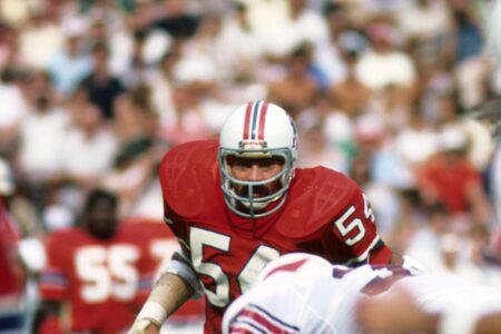
I know some of you guys are anxious to see Pat out there again on our helmets, but I think it's a terrible graphic for a helmet logo. Way too complex to the point of being impossible to distinguish at a distance if you don't already know what that is.
Pat's head, on the other hand, just the head, face and tricorn, would be sufficiently distinctive to be an interesting logo, and would be a callback to the past without giving casual fans no idea whatsoever who that team in red is
So what do you think about just Pat's head, with the red tricorn hat, as a callback to Pat history without the graphic confusion and indistinctness? I think it would turn a poor, confusing graphic into one of the better throwback logos, and very distinctively Patriot.