- Joined
- Jun 17, 2000
- Messages
- 19,870
- Reaction score
- 31,418
Registered Members experience this forum ad and noise-free.
CLICK HERE to Register for a free account and login for a smoother ad-free experience. It's easy, and only takes a few moments.
Silver?I don't like that star. Stay far away from specific skin tone as possible.
Any person can be really, really, really, really bad at a particular thing, or completely blind to something which is totally obvious to most of the world.Bob seems to be doing this stuff for no reason.
I'll just remind everyone that the flying elvis is the disgusting, insulting, nauseating image of a sick, sad, diseased, decaying corpse of a traitorous loyalist.I like the general concept but, as with Flying Elvis, I'm not too keen on the pallor of death skin tone.
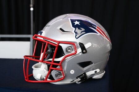
Weird. We had a top 5 uni and logo in the NFL (red and pat patriot) and switched to one that the majority of NFL fans thought was a big downgrade.
I’m the only Pats fan in my family (live in Vancouver) and was watching the Sunday night retro game with my brothers at my Dads place. My bro commented how nice the old red uni’s looked and even my 86 year old Dad mentioned that they are one of the best ever. Neither of them like the Pats.
I personally prefer Pat Patriot over Flying Elvis, but at this point the Flying Elvis is iconic. It’s what adorned their helmets as they terrorized the league for 20 years. Changing it would be really bad for the brand.I Like it... modern version of Pat Patriot...
but i gotta admit, flying elvis has grown on me over the years...
That is because of the tremendous success the team has had since the logo was adopted. Now we have reached the part where Elvis is fat and drug addled. I am afraid that the 2019 super bowl is the equivalent of "Burning Love", aka Elvis' last hit before fading away and passing away. Captain Parker Belichick has run out of schemes to make Elvis successful. The new logo is the love child of Elvis and Pat. Time for the younger generation to take over.I Like it... modern version of Pat Patriot...
but i gotta admit, flying elvis has grown on me over the years...
That's quite the analogy.That is because of the tremendous success the team has had since the logo was adopted. Now we have reached the part where Elvis is fat and drug addled. I am afraid that the 2019 super bowl is the equivalent of "Burning Love", aka Elvis' last hit before fading away and passing away. Captain Parker Belichick has run out of schemes to make Elvis successful. The new logo is the love child of Elvis and Pat. Time for the younger generation to take over.