PatsFans.com Menu
PatsFans.com - The Hub For New England Patriots Fans

NESN: Hard to Believe This Monstrosity Almost Became Pats Logo


Status
Not open for further replies.

PatsFanInVa

PatsFans.com Supporter
2020 Weekly Picks Winner
Joined
Mar 19, 2006
Messages
33,984
Reaction score
14,474
Oh this is going to chafe for APF...

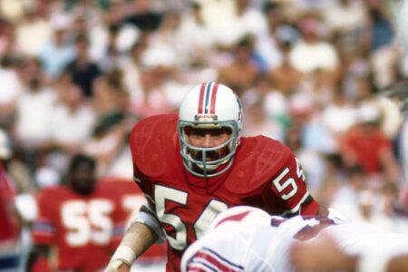
It’s Hard To Believe The Patriots’ Logo Almost Became This Monstrosity

Yes, praise for both the present logo and the old cartoon logo... and bile for the squared off man in the mountain they tried to roll out wayyyyy before (and way different from) the Flying Elvis. You could call this the "Fried Peanut Butter and Banana Sandwiches Elvis." Heavy and vomit-inducing.

But not the same as either the predecessor or the present.
 
I looks like a front page logo for a presentation I would design quickly in MS Paint for a PowerPoint that I would be throwing together at 11:30 PM, and was due at midnight, during my freshmen year of college.
 
Doesn't really bother me - it's just as good as any logo. Logos are not really relevant. Wins and trophies are...
 
Like the geese flying north, a Pats logo story signals the offseason is fully here.
 
Looks awesome
 
I was there for the 'vote' game. Not even Goodell draws the kind of booing that monstrosity got from us. Back when the team was the redheaded step child of Boston sports we long timers sported Pat Patriot gear like a badge of honor.
 
This made me legit lol.

The solider is kind of cool, but that logo? It looks like someone with a passion for Mt. Rushmore or The Old Man on the Mountain got their hands on Microsoft Paint a decade before its 1985 release. Say what you will about the “Flying Elvis,” but it’s much better than USAA Patriot.
 
This is better than Elvis
That’s because it’s left to right representation of the American flag (and our logo) is a perfect Marxist Commie alternative infiltration. Might as well double our fluoride while you’re at it.
 
That’s because it’s left to right representation of the American flag (and our logo) is a perfect Marxist Commie alternative infiltration. Might as well double our fluoride while you’re at it.

source.gif
 
That’s because it’s left to right representation of the American flag (and our logo) is a perfect Marxist Commie alternative infiltration. Might as well double our fluoride while you’re at it.

The proposed jerseys had chemtrails criss-crossing them.
 
Looks like Che Guevara’s heel turn to capitalism.

upload_2020-2-24_8-59-33.jpeg
 
Can we all agree that Patriot Man underneath the logo whips though

I don't know...looks like if Captain America, Aquaman and George Washington had a threesome.
 
Looks like someone was coming out with a Captain Patriot comic book....in 1947
 
Aw, yeah! The bat signal has been turned on. Wait! I hear his theme music now...

Na na na na na na na na...
APFMAN!

Regards,
Chris
 
Status
Not open for further replies.


MORSE: Patriots QB Drake Maye Analysis and What to Expect in Round 2 and 3
Five Patriots/NFL Thoughts Following Night One of the 2024 NFL Draft
Friday Patriots Notebook 4/26: News and Notes
TRANSCRIPT: Patriots QB Drake Maye Conference Call
Patriots Now Have to Get to Work After Taking Maye
TRANSCRIPT: Eliot Wolf and Jerod Mayo After Patriots Take Drake Maye
Thursday Patriots Notebook 4/25: News and Notes
Patriots Kraft ‘Involved’ In Decision Making?  Zolak Says That’s Not the Case
MORSE: Final First Round Patriots Mock Draft
Slow Starts: Stark Contrast as Patriots Ponder Which Top QB To Draft
Back
Top