Canada's #1 Pats Fan
Rotational Player and Threatening Starter's Job
- Joined
- Aug 18, 2006
- Messages
- 1,355
- Reaction score
- 0
Registered Members experience this forum ad and noise-free.
CLICK HERE to Register for a free account and login for a smoother ad-free experience. It's easy, and only takes a few moments.
Oh come on, how can the Colts' uniforms be considered "average" by anyone? First and foremost, they have no business wearing this uniform to begin with -- it belongs to a bygone era in Baltimore. Second, it's the plainest, most austere look in the league. You're just being a homer. The team should've been renamed after it was carpetbagged by the slimeball Irsays and moved west. Even Johnny Unitas and John Mellencamp disowned them.

3. Packers (Those yellow pants creep me out.)
That being said, I must assume that a Packers/Steelers Super Bowl would creep you out even more?
This is the worst list ive ever seen. Patriot jerseys are soooo plain and original. Colts are ok, kinda like the Cowboys though..Throughbacks dont count, they barely use them.
But heres my list:
BEST
1. Giants
2. Chargers
3. Broncos
4. Eagles
5. Buccaneers
Average
1. Colts
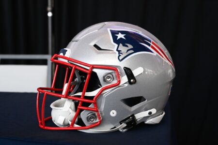
2. Patriots
3. Cowboys
Worst
1. Jets
2. Steelers
3. Browns
4. Packers
5. Seahawks
Acknowledged by whom?i think it was widely acknowledged the chargers throwback's were the best
l
That being said, I must assume that a Packers/Steelers Super Bowl would creep you out even more?
I understand its a pats site but how can the Bills Throwback Uniforms not make it on anyones BEST list