PatsFans.com Menu
PatsFans.com - The Hub For New England Patriots Fans

OT: Best looking jerseys in the NFL?


Status
Not open for further replies.
Best:
1. Bucs - great use of black and red along with tough logo
2. Chargers - powder blue or dark blue, both look good. Logo also looks good on its own.
3. Raiders - classic. timeless.
4. Cowboys - same as Raiders
5. KC Chiefs
6. Browns - old school

Worst:
1. Dolphins - teal and green
2. Jets - boring and ugly
3. Giants - new font is boring
4. Baltimore - looks like an XFL uni
5. Eagles - stuck in the 70's

As for the Patriots, I honestly didn't care for the new logo when it was announced. Partly because it was rumored the team was going to move to Tennessee and the logo was tied to Elvis. I would prefer the team to go back to the old logo or just redo it altogether. If I were still judging on the old logo, it would be in the top 5.

 
How can a list with my opinion be the worst list that you've ever seen? It's just my personal opinion. I guess it's the schooling in Indy- Sen. Arlen Specter should focus more of his attention there

thats ones of the funniest things i've read this week
 
I'm not trying to be a homer, but I really think the Pats have the best looking jerseys in the NFL. Also, I really do not understand the fury over the Colts jersies. Everyone seems to love them but I think they're pretty plain and ugly. Now, with that in mind, let's make a thread shall we? Who do you think has the best looking jersies and who do you think has the ugliest?


Not sure about the Jerseys, but the Bengals have the nicest helmet.

:rocker:
 
I'm not trying to be a homer, but I really think the Pats have the best looking jerseys in the NFL. Also, I really do not understand the fury over the Colts jersies. Everyone seems to love them but I think they're pretty plain and ugly. Now, with that in mind, let's make a thread shall we? Who do you think has the best looking jersies and who do you think has the ugliest? Mine:

BEST:

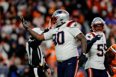
1. Pats - Obviously. Not sure if I like the home jerseys better or the white away jerseys. But the lettering, numbers, designs, colors, and of course the flying elvis make this my favorite jersey in the NFL.

2. Raiders - The silver and black makes for a pretty disgustingly mean looking jersey.

3. Steelers - See above.

4. Jaguars - The symbol and the black and green make a pretty good combination. The symbol caps it off though. It kind of helps that I live in Jax too.

5. Seahawks - Symbol to the metallic blue colors. Blows away their old jerseys by a huge margin.

6. Saints - Always liked the Saints jerseys. It just seems to represent the spirit of New Orleans to the fullest... minus the purple and white.

WORST:

1. Dolphins - God these are awful. Sometimes I like it when they wear the aqua jerseys but they don't ever. The white and white with the Dolphin as the symbol is the softest looking/worst jersey in all of football.

2. Packers - Puke green. Need I say more?

3. Colts - For reasons I explained before I posted this thread. Just really, really plain.

4. 49ers - Red and gold just doesn't do it for me.

5. Jets - Hideous. Actually, I think this is more puke green than the Packers'.

6. Titans - How are you supposed to go out there and smash someone's brains in when you're wearing baby blue?

That's pretty much mine too except for the Packers-the deep green looks nice with the gold. Raiders and Steelers are definitely tough looking, and so are the Seahawks'. At first I didn't like the unitard look but for whatever reason it gives them an illusion of being very streamlined and fit. Coupled with the dark shaded visors it's an intimidating look.
I love the Pats' silvers; it's interesting because the navy blue stripe that runs down the sides of their shirts has a kind of slimming effect on them-makes them almost look smaller that what they really are. I like that too; maybe it throws the other team off a little bit at first:cool:
The Colts' all-white uniforms is just stupid looking for football, even more stupid than the Fins' aqua and tangerine. Although Will Farrell's (?) commercials have bumped up the aqua to something just nasty.

I think that was the first time I have ever seen those words together.
 
I think that was the first time I have ever seen those words together.

A lot of people dislike them, and I agree they look gross when they're dirty but I think they look sharp with the navy blue. I wish they'd embellish Elvis though- maybe separate the stripes of his hat or make the tips of it more free-flowing and a tiny bit wilder looking. Nothing crazy, but just tweak it a little bit.
 
The idea of athletic team colors is descended from the colors that knights used to use in jousting tournaments. They were meant to be colorful.

I hate the trend to business suit colors - navy blue and black - and the increasing use of monochrome uniforms like Seattle's, which look like pajamas. The worst, though, are the all black uniforms. I love it when some posters say white or powder blue looks weak. Those all black Ravens uniforms really intimidated everyone this year and those fearsome black and silver uniforms have certainly made the Raiders consistant winners.

Let's face it, uniforms have nothing to do with whether a team wins or loses. Uniform designs are done to please the owners and maybe a bit to please the fans.

Best uniforms:
Old Cardinals uniform
Old Chargers powder blue uniform
Old Redskins uniform with the spears on the side of the helmet
Honorable mention: Kansas City, New England

Worst uniforms:
All black uniforms worn by Baltimore, Jacksonville, and New Orleans
Raiders uniform
Cincinnati's uniform with the varicose pumpkin helmets.
Dishonorable mention: Buffalo's new away uniforms with the blue field across the shoulder pads.
 
Last edited:
Best and worst uniforms is a tough call. I like the mix the NFL teams have of old simple classics (Raiders, Bears, Colts, Vikings), updated (Pats, Bucs) and other color combos ranging from the Jags to the Bills. Some are rather ugly but have been around for so long it would be tough to break tradition (Jets, Dolphins, Redskins, 49ers). Don't care for the same color jersey and pants like I've seen the Cardinals and Seahwaks don once or twice. Titans and Lions are two others I don't care for either but do we really want them to change to yet another red and black uniform?

There are a few teams that just don't look right in certain uniforms. Colts and Cowboys in blue rather than white, Bills in white rather than blue, and and Packers in white rather than green come to mind. I know that's inevitable with home and away but some look good in one uni but bad the next week.

Oh yeah, the Eagles throw back uniform they wore last year when McNabb had that huge game, those should go in to Canton as the ugliest uniforms of all time. Well, I sincerely hope there weren't any uniforms uglier than those from back then, because if there were then they will surely be inflicted upon us.
 
Even brady hates the Colts plain jersey, he said Vinatieri look ugly in that jersey
 
I think that was the first time I have ever seen those words together.
I love the silvers too. I think part of it is that they were winning like crazy when they wore them, something that disappeared in 2005. If anything, I wish they would deepen the silver a bit and I think that would be even better.
 
I was just pointing out how most people during gameday threads or what have you say how they don't like them.

I, personally, don't like them because, as HSanders pointed out, they are not silver enough. Which is odd, because I think the replicas fans wear look great. But on TV they just come across as a dirty white, IMHO.
 
I prefer the Pats white over the blues.

It would be cool if they would come up with a red one in the same style though, and found a way to incorporate both logos, the old and the new.
 
Ten favorite in no order....

Bengals (80's/90's version)
Seahawks (Old uniforms)
Houston Oilers
Patriots Away
Patriots throwback
Ravens (All Black)
Steelers
Eagles (late 80's early 90's lighter green)
Bills (Throwback)
Tampa Bay Bucs (Creamsicle...just because everyone hates them:D)


Ten Worst

Eagles (throwback)
Titans
Dolphins
Redskins
Jets (every version because i hate everything about them)
Broncos (throwback)
Patriots (First flying Elvis version)
Vikings (current version)
Sehawks (current version)
Ravens (Purple)
 
Last edited:
If you really want to talk about the "worst" jersies ever, I would have to put the Packers and the Lions in that group.

While on this subject, here is a helmet that was suggested for the Dolphins in 1990. It was never adopted.

Dolphins_alt_2.gif
 
The Browns have never had a logo on their helmet. I believe they are the only NFL team never to have one.

But, in the mid 60's they experimented with this one. It was worn for some pre season games but never officially adopted.

Browns_alt_1.gif
 
Last edited:
I've always loved the Saints jerseys. #1 IMO.
 
If you really want to talk about the "worst" jersies ever, I would have to put the Packers and the Lions in that group.

While on this subject, here is a helmet that was suggested for the Dolphins in 1990. It was never adopted.

Dolphins_alt_2.gif

Wow. The franchise would have been dissolved by now if this had been adopted. Awful.
 
...
The Titans baby blue is truly sissy. Maybe that was done to goose female attire sales...

I agree.

A pink shirt can, under certain circumstances, be real nice looking, but in the end it is flipping pink.

The Chargers pull of something with the similar powder blues because they are good. It's like they are saying, "We even can dress like little boys and beat the crap out of you."

Of course with that logic the best uniform would be hot pink on a great team. Problem is eventually they'll stink.

The Dolphins had that going with the aqua for decades, but now that they stink, they just look like boys among men.
While I'm on the Dolphins, I have to recuse myself on the alternate orange. All I can think of is a tribute to the '70s Bucs and that colors my impression.

Browns were OK (not great) since they were first. Old Bengals (Browns uniform with B-E-N-G-A-L-S on the helmet) sucked because it was an obvious copy. (Yes, I know the Paul Brown saga and the abnormal psychology in that.) Even if I think the new Bengals uniform sucks, I'm going to keep my trap shut because it is a big improvement. (Yes, it was that bad.:))

Good uniforms? Think primary colors, preferably dark with a contrasting primary color or silver or gold highlights. (Note, the highlight can be a "gay" color - imagine the Steelers in all gold like goldmember, but gold highlights on black are OK.)
 
Average
1. Colts

Oh come on, how can the Colts' uniforms be considered "average" by anyone? First and foremost, they have no business wearing this uniform to begin with -- it belongs to a bygone era in Baltimore. Second, it's the plainest, most austere look in the league. You're just being a homer. The team should've been renamed after it was carpetbagged by the slimeball Irsays and moved west. Even Johnny Unitas and John Mellencamp disowned them.
 
Last edited:
The Broncos are the worst - both home and road.
 
Status
Not open for further replies.


TRANSCRIPT: Patriots QB Drake Maye Conference Call
Patriots Now Have to Get to Work After Taking Maye
TRANSCRIPT: Eliot Wolf and Jerod Mayo After Patriots Take Drake Maye
Thursday Patriots Notebook 4/25: News and Notes
Patriots Kraft ‘Involved’ In Decision Making?  Zolak Says That’s Not the Case
MORSE: Final First Round Patriots Mock Draft
Slow Starts: Stark Contrast as Patriots Ponder Which Top QB To Draft
Wednesday Patriots Notebook 4/24: News and Notes
Tuesday Patriots Notebook 4/23: News and Notes
MORSE: Final 7 Round Patriots Mock Draft, Matthew Slater News
Back
Top