PatsFans.com Menu
PatsFans.com - The Hub For New England Patriots Fans

What Kraft Should Have Done Last Year, re: Deflategate


Status
Not open for further replies.
Being from NH thanks for sharing this. Not sure what I'll do with it but I LOVE it.

Can't take credit, just googled "Flying Elvis Man in the Mountain"
 
Last edited:
Wow. Speaking of googling those terms, tucked into an old article, is a link to this positively ancient article...

http://farm7.static.flickr.com/6125/5975289602_cb4a8d3d07_o.png

Sullivan's son-in-law seems to have been at the ancestral beginning of the Flying Elvis back in 1979. Here's the more current article it's tucked into:

Uni Watch: A history of the Patriots logo

The Uni Watch is really informative, right down to who designed which etc.
Thank you so much for finding this.

Of course, franchises in all the major sports often remake their logos and uniforms, and as I grew up watching sports, I always would point and laugh at them, because the new one invariably was always worse, and it was so tacky, tasteless and classless and I was thankful to be in Boston where, mostly, that didn't happen.

The marketing streamlining thing was always the big catalyst in our (Patriots) case. The grounds crew at Super Bowl XX complained about the difficulty they had painting our logo in the end zone. (Always something to complain about with the Patriots...)

I've been coincidentally thinking about the Kings lately too, as they had really among the coolest uniforms in sports(sound familiar?), and when they got Wayne and did the makeover I stopped any interest I may have ever had in them...they can win Cups as they have, it doesn't matter, they look awful.

What marketers (who make lots of money doing what they do) do not acknowledge or want to admit, is that any extra cost involved in maintaining the established logo is more than made up for in sales and merchandising. This reality may be the only way to get Kraft to reverse field...I've maintained all along that he can keep the flying elvis plastered everywhere (can't escape the thing), we long time fans simply wish to be able to watch the team on the field that we lived and died with since '61.

Respecting the feelings of those who like or are used to the flying elvis will be accomplished this way; I am quite confident that if the team opened training camp sporting their old logo and uni's, the fan reaction would be overwhelmingly positive, and I believe the players and coaches will feel the same.
We want wins, not red shirts and static-tripod old-time constipated cartoon character logos.
 
Rodger Goodell was a nobody when the uniform switch was made. That was still the Tagliabul era. Orthwein may not have recognized the profile, and the know-nothing national media dubbed it Flying Evis; but we true blue New Englanders recognized the traditional "Man in the Mountain" profile immediately, and accepted it and Bill Parcells.
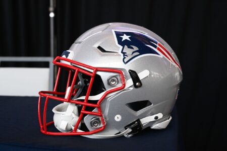
Parcells preferred Pat Patriot, from his days as an assistant here.
 
We want wins, not red shirts and static-tripod old-time constipated cartoon character logos.
It is not an "either/or" scenario. Wins are good, but we're not in Baltimore or Houston. Don't you hate Dallas, Pittsburgh, the Redskins? Winning rings with no class and being disgraceful is meaningless, and that's why the BB/TB run is important and special. We should at least try it for a season, and see how you feel at the end (whether we go all the way or not).
 
It is not an "either/or" scenario. Wins are good, but we're not in Baltimore or Houston. Don't you hate Dallas, Pittsburgh, the Redskins? Winning rings with no class and being disgraceful is meaningless, and that's why the BB/TB run is important and special. We should at least try it for a season, and see how you feel at the end (whether we go all the way or not).
I'm just yankin' your chain, APF. I like Pat Patriot. But I also like the blue/silver/red scheme and Flying Elvis. The page turned long ago, there's no going back. Actually, they could move forward replacing the silver with a buff/tan tone ...

adult-george-washington-costume.jpg
 
I'm sorry, but in design, the 17th century is over (yes, 17th century, not 1700s...)

If it ain't baroque, don't fix it.

Unfortunately, Pat Patriot is baroque. Too much crap going on. But any time you have an "Old logo/New logo" issue going on, you'll have these hardcore fans just apesh1t about whatever is oldest.

Pat Patriot is a moment in time, a very busy moment in time.

Hell, there's a bit more going on with FE than I'd like (and that proto-Elvis was worse).

Let's see, what would I do if it were 1960 and I were starting from scratch (with the benefit of modern sensibilities....) What would be something you could really sink your teeth into... Hmmmmm...

Meh, I erased a bunch of stuff. Don't have an art program here, and you really have to sketch it out not describe it... but I think I might want the HELMET to be navy blue rather than white or silver. You'd get in a white and a red stripe, I think... I'd possibly run em up the sides of the Navy Helmet (like he Rams but not curling back in - so you get a ballistic Arc, with stripes widening as they get toward the front). I might put a star at the front, "straddling" the front of the helmet, dunno). Getting outside this whole conversation w/Pat Patriot, FE... get the faces out of it completely...

This doesn't "feel" like a Pats helmet of course, there's no past associated with it, just thinking what would be simple and capture who we are. "Sounds" terrible, I am sure. Can't even tell without the art tools. Might look like hell too... there's a reason you have 20 logo slicks just for 1 concept.
 
To me, it's really not complicated.

Since the franchise's inception, people have been giving sh*t to the Patriots. Yes, we were homeless, staying in hotel rooms and living out of suitcases for eleven years. Then, we had a ramshackle stadium, and the whole time had an owner who did some bad things (along with some good ones). But this was never any reflection on the players, coaches or fans here.

It's the ones dumping sh*t on us who suck. Always has been. Whether we won or lost. To me, embracing the flying elvis validates and empowers THEM. I would not trade the 33 years we spent rooting for the Pats for ten Super Bowls. Yes, leave the losing and suffering behind, but having our identity stolen in '93 robbed us of the chance for US to put those losers in their place.

Thinking about the Redskins, Niners, Bears, Cowboys, Giants, Broncos winning Super Bowls makes me want to vomit. They all suck. None of them could carry the Patriots' jockstrap when it comes to overcoming adversity, and showing character and courage and teamwork when up against derision and disrespect. Rodney NEVER exaggerated about us.

The way this team has been treated by the league now, specifically in '07 and '15, I cannot comprehend how everybody does not see this. And it's not over. The next railroading is right around the corner.

Justice, to me comes one way: We stand together and say, "We are the New England Patriots. Always have been. F*ck You."
 
I'm sorry, but in design, the 17th century is over (yes, 17th century, not 1700s...)

If it ain't baroque, don't fix it.

Unfortunately, Pat Patriot is baroque. Too much crap going on. But any time you have an "Old logo/New logo" issue going on, you'll have these hardcore fans just apesh1t about whatever is oldest.

Pat Patriot is a moment in time, a very busy moment in time.

Hell, there's a bit more going on with FE than I'd like (and that proto-Elvis was worse).

Let's see, what would I do if it were 1960 and I were starting from scratch (with the benefit of modern sensibilities....) What would be something you could really sink your teeth into... Hmmmmm...

Meh, I erased a bunch of stuff. Don't have an art program here, and you really have to sketch it out not describe it... but I think I might want the HELMET to be navy blue rather than white or silver. You'd get in a white and a red stripe, I think... I'd possibly run em up the sides of the Navy Helmet (like he Rams but not curling back in - so you get a ballistic Arc, with stripes widening as they get toward the front). I might put a star at the front, "straddling" the front of the helmet, dunno). Getting outside this whole conversation w/Pat Patriot, FE... get the faces out of it completely...

This doesn't "feel" like a Pats helmet of course, there's no past associated with it, just thinking what would be simple and capture who we are. "Sounds" terrible, I am sure. Can't even tell without the art tools. Might look like hell too... there's a reason you have 20 logo slicks just for 1 concept.
What color masks, red, white or grey?
 
Let's go white masks... again its hard to imagine what works together w/o the art tools.

I started a version using Paint, couldn't get a sideways star, now cant get Lightshot to make the link work.
 
Part of me wants a musket in there, with a silver musket ball instead of a star... but again, getting complicated
 
I wonder something now...

In this day and age, you have to imagine some trompe l'oeil design could be created where the helmet IS the hat

I mean if they can do this...

hqdefault.jpg
 
I wonder something now...

In this day and age, you have to imagine some trompe l'oeil design could be created where the helmet IS the hat

I mean if they can do this...

hqdefault.jpg
Well, whatever it is, it's bound to be more interesting than the Browns', or one side of the Steelers'...

I think we're headed in the direction of the intricacies of modern goalies' masks
 
I was just thinking of using shading that would make a Navy blue helmet a three-corner hat... not a bunch of extraneous color, though maybe get the red and white in there as stripes giving the hat a hard outline. So in other words, dark blue shading to black, to make the "Hat on a Hat" concept less of a decal, but you're probably right. You really want something a third-grader can sketch in crayon...

you know how hard I tried to draw Pat Patriot a number of times? I'm a grownup now, but it's probably ALMOST as hard to draw FE. You could do it... e.g., you don't have to get the elbow angle on the knee right, you don't have to draw a scowl face... but it's still a face-logo... was just trying to make the hat work...

Check out tunescribe's picture above, while we're being goofy... think about jerseys incorporating a stylized scheme with the overcoat, vest, shirt scheme. Remember, I SAID "stylized." So you can tell at a distance what it should be, but close up it doesn't look like a ridiculous cartoon. With all the swoops and stripes and slashes on today's uniforms, this wouldn't be a tremendous departure... Basically what you'd be doing is making a Pat Patriot uniform for everybody but very stylized. Make the player the Patriot, not put a picture of another guy who's the Patriot on their head...

I know I know... we'd all have to SEE it :)

Probably best off to go with FE lol
 
Kraft/Patriots were criticized for their initial and subsequent handling of insane ball tampering charges; however, after what happened in '07, how can they be blamed for trying to defend themselves against further defamation?
 

A nice example of NFL predjudice against Pats. Oh, thanks again Thomase.
 
Status
Not open for further replies.


Patriots News 4-28, Draft Notes On Every Draft Pick
MORSE: A Closer Look at the Patriots Undrafted Free Agents
Five Thoughts on the Patriots Draft Picks: Overall, Wolf Played it Safe
2024 Patriots Undrafted Free Agents – FULL LIST
MORSE: Thoughts on Patriots Day 3 Draft Results
TRANSCRIPT: Patriots Head Coach Jerod Mayo Post-Draft Press Conference
2024 Patriots Draft Picks – FULL LIST
TRANSCRIPT: Patriots CB Marcellas Dial’s Conference Call with the New England Media
So Far, Patriots Wolf Playing It Smart Through Five Rounds
Wolf, Patriots Target Chemistry After Adding WR Baker
Back
Top