Actual Pats Fan
Pro Bowl Player
- Joined
- May 26, 2016
- Messages
- 10,390
- Reaction score
- 10,235
Oh god, I was afraid that @Actual Pats Fan was going to resurrect this thread...
Registered Members experience this forum ad and noise-free.
CLICK HERE to Register for a free account and login for a smoother ad-free experience. It's easy, and only takes a few moments.
Oh god, I was afraid that @Actual Pats Fan was going to resurrect this thread...
I think the real reason old timers like myself like Pat Patriot because he was kind of unique for a football mascot. And he was a lineman, not a QB or WR. He represented the gritty hard working, grind it out, no BS character, that so accurately represented the NE area.
The Flying Elvis, when it came out was just too slick and artsy for many of us. Now over the years, it has grown on me. Maybe all the winning has imprinted it on us in a positive manner. The reality is that there is no going back, but it is good to see that the team hasn't buried Pat Patriot and pretended it didn't exist.
My apologies to the OP, but I'm with those who like the new logo better. It's cleaner, and more balanced IMHO. But that's all it is....my opinion.

")
I might be in the minority but I love the flying elvis logo and scheme.. One of the best in sports IMO... Iconic, like Celtics, Yankees etc.


Kraft needs to paint the helmets already and give the people want they want a game or two a season. Seeing how they're too cheap to paint the field for preseason I'm not holding my breathe lol.I think the real reason old timers like myself like Pat Patriot because he was kind of unique for a football mascot. And he was a lineman, not a QB or WR. He represented the gritty hard working, grind it out, no BS character, that so accurately represented the NE area.
The Flying Elvis, when it came out was just too slick and artsy for many of us. Now over the years, it has grown on me. Maybe all the winning has imprinted it on us in a positive manner. The reality is that there is no going back, but it is good to see that the team hasn't buried Pat Patriot and pretended it didn't exist.
My apologies to the OP, but I'm with those who like the new logo better. It's cleaner, and more balanced IMHO. But that's all it is....my opinion.
Celtics: just ignore the alternatesI might be in the minority but I love the flying elvis logo and scheme.. One of the best in sports IMO... Iconic, like Celtics, Yankees etc.
Edit: I may sound like a huge homer (or not) but I think Boston has an argument to the best uniforms in all 4 major sports.
I agree -- "graphically-dated" is a great way of describing it. I like the new logo because the font looks modern.I can understand being attached to the old logo, but IMO they were right that the puffy cursive was graphically dated and lacking punch. It's a minor league baseball kind of font:
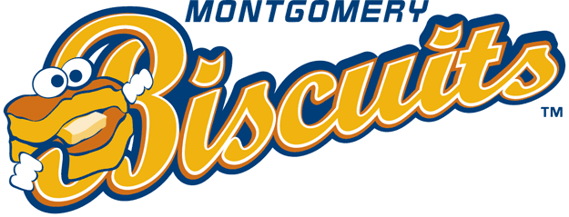
Most of the time, I think I would prefer the old-fashioned font...the modern style is typically more boring and even lifeless, whereas the classic is just what it was intended to be back when it was made: stylish, appealing, special, classic in all the good ways...I agree -- "graphically-dated" is a great way of describing it. I like the new logo because the font looks modern.
I can't argue. Block lettering is dull and unattractive...I'm totally OK with having this, and if the stupid grounds crew still wants to complain, how about we threaten to return Pat Patriot? (I just want him back on our helmets...)

So nice...
They both suck horribly compared to Pat PatriotI ordered a Patriots grill cover from Wal-Mart that I was very excited about. The picture showed that it was the old logo, the cursive font with the Flying Elvis over the P - my favorite. When it came in the mail and I opened it up I was pissed to see that it was this new ****ty logo we use now, NOT what I ordered. I was so pissed I returned it because it's so awful looking. I don't buy any Pats merchandise with this awful looking logo on it, and it's a shame now that they updated our jerseys this year to have that crappy looking thing on them.
I had a customer at work the other day who was wearing one of those really nice Nike Therma-fit sweatshirts with the old logo on the front. I asked him about it and where he bought it, head online when I get home to order one because it was really very nice looking. Sure enough they have all been updated and replaced with the new logo. I can't be alone in thinking that this new font is horrendous right?
I know lots want Pat Patriot back but I grew up with the nice cursive font and I like it a lot. Most of my Pats stuff I own has that logo on it, there's just something about the way it looks... I really wish they would have never changed it. It's very hard to find a lot of the products I want (jackets, hoodies) because they are all ruined with the new logo. Even our end zones look awful now.
Am I alone in wishing the cursive font logo would return? Or am I alone in even caring this much?