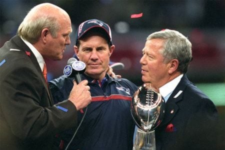
It lost its mojo.But...That cursive logo was on the field when they won 3 out of 4 Super Bowls...how soon we all forget.
SITE MENU
Registered Members experience this forum ad and noise-free.
CLICK HERE to Register for a free account and login for a smoother ad-free experience. It's easy, and only takes a few moments.
It lost its mojo.But...That cursive logo was on the field when they won 3 out of 4 Super Bowls...how soon we all forget.
The new one. It's straight forward and all business. Just like the Team.
Actually I find the new font reminiscent of the Red Sox fontThe new one is way better than the cursive style overused by baseball teams.
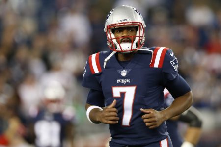
I know lots want Pat Patriot back
")
I don't see it as an insult tbh, but maybe I just haven't been around here enough. I see a disagree as just that, "I disagree with your opinion." That's alright. Doesn't make me hate you...ok, it does make me hate you because if you disagree with me you're wrong, but still not a big dealWhy the disagree? Wasn't the OP asking a question or an opinion?
Or maybe you just don't think the Pats mean business. And if that's the case, well, I really think you would disagree with where you can go with that.
QuantumMechanic, nevermind. I see the past posts and you gave everyone a disagree that liked the new logo. Ease up a bit buddy
Right, just likePat patriot is a cartoon that has no business being a logo.

If it ain't broke and you don't change if you can't get all the $ of people who want the new ones.I have nothing against the new one, it's solid. But the old one was better. If it ain't broke..
I was at one of the games when they were contemplating the logo change. At halftime they brought out the two logos, Pat Patriot to lots of cheers and the Flying Elvis to overwhelming boos. That delayed the new logo for a year or two and when it was finally introduced they skipped the fan polling.I first started following the team (not trying to put on fanboy airs, just trying to add weight to my point) in 1981. As the team slowly started to improve and experience some success in the mid to late 80s, my elementary and middle school wardrobe was full of Boston sports teams. I had a Pats hoodie, sweatshirt, hat, all kinds of t-shirts, etc. When my dad used to take me to games back in the 80's, I was dressed to the 9s in Pats garb.
As the 80s closed out and the 1990s started, the team - on all levels was an unmitigated disaster. I welcomed the Flying Elvis. With that came of course Parcells, Drew, Kraft, etc. It was a new beginning. "Thank God", I said. To me, when I look at FE, I think, "dominance", "dynasty", "unrelenting", and most importantly, "winning".
A little off-topic here from the OP (cursive or block, I don't care) but with all the success the team has experienced these last 14 years the identity of this era is with the Flying Elvis. Part of me doesn't want to screw with success and what that logo does to the psyche of other fans and teams but the other part of me wishes that BBs gray hoodie has a "Pat" on it instead of an Elvis
Where the hell have you been, Shmessy? Seems you've been gone for most the off-season.Cursive curly cues are for knitting shops and lingerie boutiques.
I honestly don't even remember making this post... So I have no follow up.If it ain't broke and you don't change if you can't get all the $ of people who want the new ones.
Why do you think they do throwbacks?
Oh god, I was afraid that @Actual Pats Fan was going to resurrect this thread...

Looking at threads is a lot like buying milk.Where the hell have you been, Shmessy? Seems you've been gone for most the off-season.
Don't worry, they'll close it down shortly...Oh god, I was afraid that @Actual Pats Fan was going to resurrect this thread...
My goodness, they changed it back already? I swear I didn't even notice. They've looked just the same to me so far this whole preseason.Looking at threads is a lot like buying milk.
Did you check the date on that?