PatsFans.com Menu
PatsFans.com - The Hub For New England Patriots Fans

Does anyone actually like our new logo?


Status
Not open for further replies.
I first started following the team (not trying to put on fanboy airs, just trying to add weight to my point) in 1981. As the team slowly started to improve and experience some success in the mid to late 80s, my elementary and middle school wardrobe was full of Boston sports teams. I had a Pats hoodie, sweatshirt, hat, all kinds of t-shirts, etc. When my dad used to take me to games back in the 80's, I was dressed to the 9s in Pats garb.

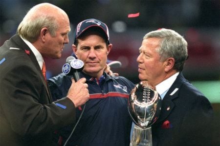
As the 80s closed out and the 1990s started, the team - on all levels was an unmitigated disaster. I welcomed the Flying Elvis. With that came of course Parcells, Drew, Kraft, etc. It was a new beginning. "Thank God", I said. To me, when I look at FE, I think, "dominance", "dynasty", "unrelenting", and most importantly, "winning".

A little off-topic here from the OP (cursive or block, I don't care) but with all the success the team has experienced these last 14 years the identity of this era is with the Flying Elvis. Part of me doesn't want to screw with success and what that logo does to the psyche of other fans and teams but the other part of me wishes that BBs gray hoodie has a "Pat" on it instead of an Elvis
Actually, the team slowly got mostly worse (with the exception of 85, and 86 ) after 81. The team of the mid to late 70s was kick ass compared to the remnant left that made Super Bowl 20. That Super Bowl 20 team was really like year 10 of a good run that was ending. It was the remnant but it made a nice playoff run until the Bears.
 
I ordered a Patriots grill cover from Wal-Mart that I was very excited about. The picture showed that it was the old logo, the cursive font with the Flying Elvis over the P - my favorite. When it came in the mail and I opened it up I was pissed to see that it was this new ****ty logo we use now, NOT what I ordered. I was so pissed I returned it because it's so awful looking. I don't buy any Pats merchandise with this awful looking logo on it, and it's a shame now that they updated our jerseys this year to have that crappy looking thing on them.

I had a customer at work the other day who was wearing one of those really nice Nike Therma-fit sweatshirts with the old logo on the front. I asked him about it and where he bought it, head online when I get home to order one because it was really very nice looking. Sure enough they have all been updated and replaced with the new logo. I can't be alone in thinking that this new font is horrendous right?

I know lots want Pat Patriot back but I grew up with the nice cursive font and I like it a lot. Most of my Pats stuff I own has that logo on it, there's just something about the way it looks... I really wish they would have never changed it. It's very hard to find a lot of the products I want (jackets, hoodies) because they are all ruined with the new logo. Even our end zones look awful now.

Am I alone in wishing the cursive font logo would return? Or am I alone in even caring this much?

patriots.jpg


I like the new one better than the old one.
 
They both suck horribly compared to Pat Patriot
True, but we've got to have compassion for people who accept and like, and are making the best of, F.E.

And I know, that no matter how mad I am about it, we'll only get somewhere with Bob Kraft through open communication and acceptance that he really believed he was doing the right thing...

I appreciate folks here putting up with my rants on the topic, especially those who like F.E.
 
I don't care what the logo looks like as long as they keep the other 31 hating and very jealous the Pats existence.

Actually, I think the team should change their name to The "Go F*** Yourselves!" They can use a cursive font if they like. A clear, clean message to the other 31 and the NFL in general.
Post of the Century.

I just think that message is best conveyed by old Pat on our helmets

I can see the end zones clearly in my mind. Even have flying elvis blended over the "G"

When I buy the team, you're my first hire for marketing, public relations, write your ticket...
 
Post of the Century.

I just think that message is best conveyed by old Pat on our helmets

I can see the end zones clearly in my mind. Even have flying elvis blended over the "G"

When I buy the team, you're my first hire for marketing, public relations, write your ticket...
You like the old logo better? When the hell did this come about?
 
Post of the Century.

I just think that message is best conveyed by old Pat on our helmets

I can see the end zones clearly in my mind. Even have flying elvis blended over the "G"

When I buy the team, you're my first hire for marketing, public relations, write your ticket...
I don't care what the logo looks like as long as they keep the other 31 hating and very jealous the Pats existence.

Actually, I think the team should change their name to The "Go F*** Yourselves!" They can use a cursive font if they like. A clear, clean message to the other 31 and the NFL in general.
:DLOL - suffocating, need oxygen, already called 911, ambulance on the way...
 
They should get rid of the pat patriot head Nd just leave the letters.


Sent from my iPhone using Tapatalk
 
I prefer Pat Patriot.
The new logo does look great in the end zone, but I don't like how it looks on apparel.
 
I prefer Pat Patriot.
The new logo does look great in the end zone, but I don't like how it looks on apparel.
From the above referenced article:

MC: "Hey, you know what? Let's put it to a test vote with the fans."...And he knew -- he knew -- that that baby wasn't gonna fly with the fans...So we had this halftime vote. I was standing right in the owner's box, and it was obvious what was going to happen. I felt like a young lamb going to slaughter. They booed the hell out of that thing.

UW: Now let's fast forward more than a decade, to 1993. Bob Kraft has bought the team, and the Patriots come out with a new helmet logo -- the one that's now commonly called Flying Elvis -- and it looks a lot like the one you tried to introduce back in 1979.

MC: No question about it.

UW: What was your reaction the first time you saw it?

MC: I recognized it right away. The similarities were obvious -- you couldn't miss it.
 
Status
Not open for further replies.


MORSE: Patriots Draft Needs and Draft Related Info
Friday Patriots Notebook 4/19: News and Notes
TRANSCRIPT: Eliot Wolf’s Pre-Draft Press Conference 4/18/24
Thursday Patriots Notebook 4/18: News and Notes
Wednesday Patriots Notebook 4/17: News and Notes
Tuesday Patriots Notebook 4/16: News and Notes
Monday Patriots Notebook 4/15: News and Notes
Patriots News 4-14, Mock Draft 3.0, Gilmore, Law Rally For Bill 
Potential Patriot: Boston Globe’s Price Talks to Georgia WR McConkey
Friday Patriots Notebook 4/12: News and Notes
Back
Top