PatsFans.com Menu
PatsFans.com - The Hub For New England Patriots Fans

Best Patriots Helmet Logo


THE HUB FOR PATRIOTS FANS SINCE 2000

MORE PINNED POSTS:
Avatar
Replies:
312
Very sad news: RIP Joker
Avatar
Replies:
316
OT: Bad news - "it" is back...
Avatar
Replies:
234
2023/2024 Patriots Roster Transaction Thread
Avatar
Replies:
49
Asking for your support
 

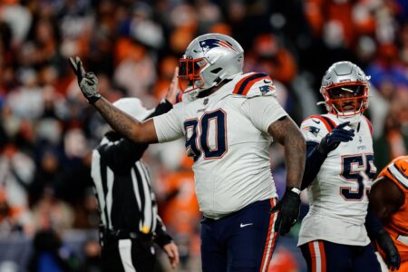
Lets Settle it. Which Patriot Helmet Logo is the Best?


  • Total voters
    157
Wow, my vote was the 68th vote and it's now tied at 34 each.
 
btw, who coined it the flying elvis? why?
 
Flying Elvis for the helmet. I like the new uniforms as opposed to the old ones anyway. But, out of the two, Pat Patriot is the cooler logo.
 
Flying Elvis for me.

What should be cool is the blue jersey, only in red.

I personally don't like Pat Patriot... It looks like a guy holding Mr. Hankey... but to each to it's own.
 
Flying Elvis feels much more modern. I think the Patriots throwbacks are the best uniforms in the NFL, even better than the current uniforms. But since this is simply which helmet do I prefer, I have to vote Flying Elvis (on current uni's, not 90s).

Also I don't really like the idea of mixing the 2 uniforms, Pat Patriot would NOT work on current unis, and I think Flying Elvis would be awful on throwbacks, it's hard to compare the 2 without looking at the entire uniform in my opinion.

I think this question, while generating a lot of debate, would be better if were based on the uni's instead of just the helmet. I think that both logos work really well for their uni.

However, if you play Madden you can mix and match the uni's. I really like the current logo on the helmet with the throwback red and current navy pants. That uni to me looks sick.

In this case, I think the current logo for the helmet is the best but my favorite logo is PP.
 
Never cared much for the Pat Patriot logo although I tried to talk myself into it since the Patriots were my team. I've been very happy with the Flying Elvis.
 
Pat Patriot LOOKS like a football player and not a dead singer, although Elvis was the King. Just the fact it's described as Flying Elvis should eliminate this logo from discussion. <chuckle>
 
no game...Pat Patriot is the best possibile logo - the greatest !
 
That's because he has dark hair and you think he looks Italian. ;)

Hi Tune, what i like in Pat Patriot is that he looks like tenacious, never give up, loyal/fair too

ps = i'm no more only dark...now also grey...this evening i will start looks play-offs - a nice week - end
 
Last edited:
In a future throwback game, I would like to see them with their original logo the tricorn hat (sp?).
 
I remember when I was a kid around 1970-72 don't remember exactly, all the kids had "cool" football helmets like the Jets and Green Bay. My dad took me to the store to get some gear for backyard games and I picked out a Green Bay helmet but he told me to get a Patriots helmet. I did reluctantly and boy did that get around. EVERYONE knew and couldn't believe I had a Patriots helmet.

Years later I was glad I had the Pat Patriot helmet and kept it on display during the 85 season and after.My small son played with the helmet outside and some kid stole it.

I was attached to that logo and hated the Flying Elvis when it first came out. Now the Pat pPatriot logo looks dated and the Elvis and Blue uniform look great. By the way, why was the old Patriots unifom the color of the British Redcoats? The Blue ones today are more appropriate. I noticed that too at a White house ceremony on TV where a ceremonial military band was parading around in colonial uniforms for some Chinese official. They were all in RED!
 
How many times a year do we settle this...

Elvis has taken us to 5 freakin' superbowls in 17 seasons and won 3 of them on the road to a dynasty. Pat is close to the Peyton Manning of franchise logos...Took us to the promised land once in almost 30 and lost. Pat was a great guy, but like the teams he represented not terribly competitive by and large. Elvis on the other hand represents the culture change that resulted in a franchise that gives opponents nightmares even in his infrequent down years...
 
Where is the tri-cornered hat?:) It was better than the guy taking a dump.
 
Yeah, remember how after the Tampa Bay Bucs changed their uniforms suddenly they were a new team and went to the Super Bowl. Didn't last though.
 
I like the tri-cornered hat for it's simplicity. I like that flying skull logo that someone has fashioned....that one looks like it means business!
 
I guess it's really about how the logo makes you feel.

Pat Patriots is nice to bring back for throwback day.
But I've got to favor the flying elvis and the modern uniform simply because they bring more memories of winning with them.

Pat Patriot reminds me of the 1-15, i want to put a bag over my head days, and Flying Elvis reminds me of our championship dynasty years.
Also aesthetically, I think the flying elvis look is more abstract which is nice for a logo. You don't focus in on the individual characteristics as much.
 
Like Pat more but just because it takes me back to the fun times at Schaefer/Sullivan/Foxboro in the old dirt lots along the woods across Rt 1. Had my first beer there with my dad and uncles and I got a cool jacket with Pat on the back. Still have it but it doesn't fit anymore. More fun tailgating then.

Elvis is OK, but I played TE in school so I like the O-line image.


TRANSCRIPT: Patriots Receiver Ja’Lynn Polk’s Conference Call
Patriots Grab Their First WR of the 2024 Draft, Snag Washington’s Polk
2024 Patriots Draft Picks – FULL LIST
MORSE: Patriots QB Drake Maye Analysis and What to Expect in Round 2 and 3
Five Patriots/NFL Thoughts Following Night One of the 2024 NFL Draft
Friday Patriots Notebook 4/26: News and Notes
TRANSCRIPT: Patriots QB Drake Maye Conference Call
Patriots Now Have to Get to Work After Taking Maye
TRANSCRIPT: Eliot Wolf and Jerod Mayo After Patriots Take Drake Maye
Thursday Patriots Notebook 4/25: News and Notes
Back
Top