Registered Members experience this forum ad and noise-free.
CLICK HERE to Register for a free account and login for a smoother ad-free experience. It's easy, and only takes a few moments.MassLive | Posted: 06/11 New! |
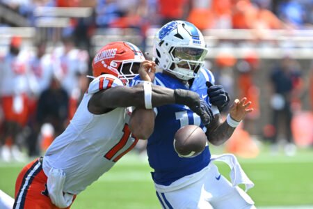
| How Patriots first-rounder is adapting to new position |
MassLive | Posted: 06/11 New! |
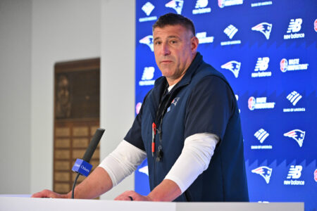
| Karen Guregian: The education of Drake Maye and how that’s taking shape in 2026 |
MassLive | Posted: 06/11 👁: 23 |
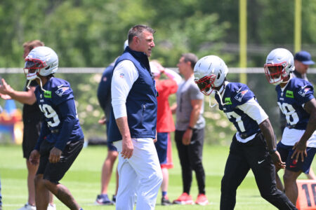
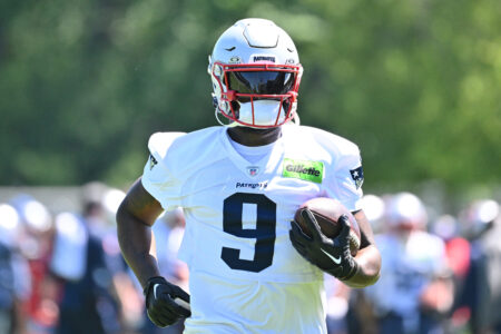
| Patriots coach has ‘very high expectations’ for under-the-radar edge rusher |
MassLive | Posted: 06/11 New! |
| Why Carlton Davis III sees Patriots defense being ‘showstoppers’ once again |
NBC Sports Boston | Posted: 06/11 New! |
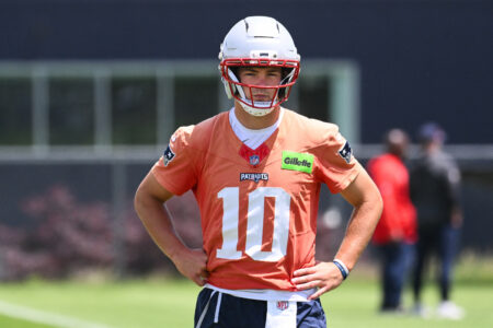
| Curran: Drake Maye could become NFL's ‘second-best QB' in 2026 |
| OT: Patrick Mahomes, Chiefs reportedly agree to reworked contract valu... 8 Reactions | 06/11 at 2:11 am |
| Mandatory Minicamp 6/9-11 5 Reactions | 06/10 at 3:06 pm |
| TODAY'S TOP POSTERS: | # | |
| Wozzy | 9 posts | |
| mayoclinic | 9 posts | |
| captain stone | 6 posts | |
| Ice_Ice_Brady | 3 posts | |
| sb1 | 3 posts |
From our archive - this week all-time:
May 27 - June 11 (Through 26yrs)