PatsFans.com Menu
PatsFans.com - The Hub For New England Patriots Fans

Fan re-designs all 32 NFL logos


ctpatsfan77

PatsFans.com Supporter
Joined
Jan 22, 2005
Messages
30,994
Reaction score
15,552
No snark here (except for the fact that, of course, nothing can help the JEST).

Pats could do a lot worse than this:

yFnE2m8h_crop_exact.jpg


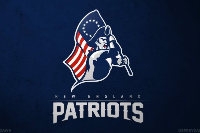
http://bleacherreport.com/articles/1779000-redesigned-logos-for-every-nfl-team
 
Outside of the lettering, that's pretty awesome.

On that list, I like the Texans, Raiders, Bears, Falcons, and Bucs.
 
The Patriot one looks really good. I would try to get rid of the tail on the bottom left. Makes him look like a ghost or something. We'd go from the flying Elvis to Pat Patriot the friendly minuteman.
 
I saw this on Deadspin a few days ago, and immediately thought the Pats were one of the best of the bunch along with the Titans.

The Cowboys, Giants, Vikings and Seahawks logos look terrible, in my opinion.
 
I saw this on Deadspin a few days ago, and immediately thought the Pats were one of the best of the bunch along with the Titans.

The Cowboys, Giants, Vikings and Seahawks logos look terrible, in my opinion.

The Raiders and Bucs are pretty bad ass too.
 
I never thought about why the Colts didn't rotate the horseshoe to make it a C. That's pretty cool.
 
The Giants logo looks like straight doodoo.
 
I never thought about why the Colts didn't rotate the horseshoe to make it a C. That's pretty cool.
Horseshoes are properly hung like a "U" so that the luck (no pun intended) doesn't fall out.
 
My litmus test for this sort of thing is if Deus Irae could crap a better logo.
Sadly, in this case, he could.

-Jamman
 
Horseshoes are properly hung like a "U" so that the luck (no pun intended) doesn't fall out.

What are they supposed to do to keep the Luck (pun intended) from falling down? :D
 
Overall very nice I thought, wasn't down with the GB or NYG logos but some of the more illustrated ones were cool, Falcons, Bucs, Browns, Raiders etc... Interesting interpretation of the Cowboys star, not sure you'd want to tamper with something that's been so successful for them.

The Patriot logo is nicely done, I agree on removing the little tail. I can see why teams try to keep helmet logos more graphic, illustrations are nice but from a distance a lot of the fine detail gets lost.

Good stuff thanks for posting Ct....
 
panthers...like it
 
The redesigned Patriots and Raiders logos jump out the most to me. The Bucs probably round out that dais.
 
Looks like what you would get if you crossed USFL logos with XFL logos....
 
Semi-OT: Fan re-designs all 32 NFL logos

Why does The Bengals look like The Grubworm sprung to ferocious life!
 
I saw this on Deadspin a few days ago, and immediately thought the Pats were one of the best of the bunch along with the Titans.

The Cowboys, Giants, Vikings and Seahawks logos look terrible, in my opinion.

This. Plus the Packers suck at an OMG level. Hard to believe it's the same guy that (re-) did the Titans.

Also, clearly not aware of the PC battle about the Redskins, dunno if the Chiefs have that going on too... best to stick to the inanimate mascot in those cases... arrows, feathers, you know, stereotyped objects as the compromise that lets you keep the team. Hell, I'd re-name 'em the Skins and make a half a potato covered w/cheese and bacon the logo.

Packers don't have a lot to work with though...ass ugly color combo, Wisconsin and cheese? Nope.

Chiefs aren't that derogatory. Skins on the other hand... :mad:
 
The redesigned Patriots and Raiders logos jump out the most to me. The Bucs probably round out that dais.

I think most of these are great, but don't love the open-mouth look on the Minuteman. The 49ers logo was probably my favorite, the Dolphins, Packers, and Jets my least favorite (Jets on pure principle, I would hate theirs o matter what). A possible improvement to the Raiders skull motif would be to add a white jogging suit and weird glasses with a neck chain :rolleyes:
 
I really like KC's logo, the Titans is pretty sweet and so is the 49er's.
 
At first I really didn't like the Patriots logo, then I looked at all the others and decided it was fine in comparison to all of that other crap.


Wednesday Patriots Notebook 4/17: News and Notes
Tuesday Patriots Notebook 4/16: News and Notes
Monday Patriots Notebook 4/15: News and Notes
Patriots News 4-14, Mock Draft 3.0, Gilmore, Law Rally For Bill 
Potential Patriot: Boston Globe’s Price Talks to Georgia WR McConkey
Friday Patriots Notebook 4/12: News and Notes
Not a First Round Pick? Hoge Doubles Down on Maye
Thursday Patriots Notebook 4/11: News and Notes
MORSE: Patriots Mock Draft #5 and Thoughts About Dugger Signing
Matthew Slater Set For New Role With Patriots
Back
Top