Don_the_patfan
On the Game Day Roster
- Joined
- Oct 1, 2005
- Messages
- 454
- Reaction score
- 31
Registered Members experience this forum ad and noise-free.
CLICK HERE to Register for a free account and login for a smoother ad-free experience. It's easy, and only takes a few moments.
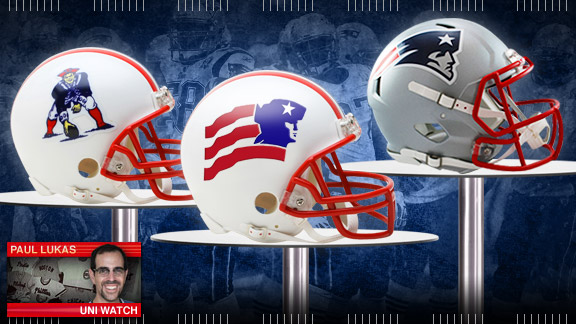
I always liked when they had the large Elvis logo draped over the shoulder pads like they did in the late 90s........a better look than where the numbers are right now
I always liked when they had the large Elvis logo draped over the shoulder pads like they did in the late 90s........a better look than where the numbers are right now
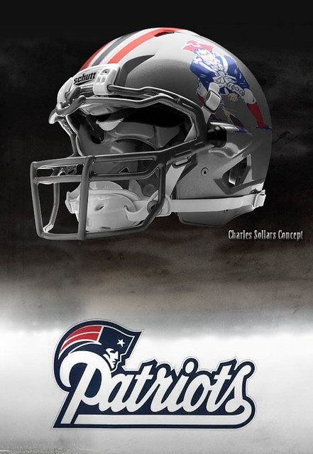
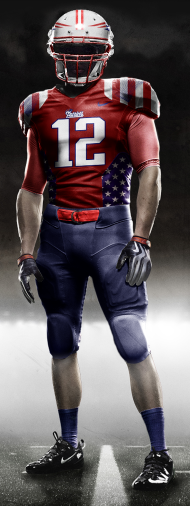
Found over at reddit made by user AgentBarcode

I sometimes miss the old red and whites so this is really an awesome concept to me. Best of both worlds since we didn't have a winning tradition until we got Flying Elvis...
Didn't like it like that at all, looked bush league.
I don't know why so many people hate on the silver an blue striped jerseys. They were the best. Bush league my ass.
Just looks kinda d-leaguish, current uniform just looks really sharp and professional. Pats road whites are easily the best in the league.I don't know why so many people hate on the silver an blue striped jerseys. They were the best. Bush league my ass.
The thing is, they woulda looked great without the ghost stripes. Who's idea was that? Everybody was squinting at the tv screen saying,"Whaa? Am I seeing things or do I notice vague vertical stripes on the blue jerseys? Or is the reception screwed up? Why'd they screw up a cool look with freaking rugby stripes?"
It's like they were trying to put one over one everyone. "Yes, we like the stripes, but most people won't, so we'll kinda sneak 'em on there without anybody really noticing."
That jersey woulda been classic if they'd only kept it solid blue. The huge Elvii draped over the shoulders were so gaudily in-your-face. That ruled.
Man, yer avatar kills me every time. It's so tarty. I gotta start posing like that just to screw with people.
hey, Pewster....I think I might change my avatar to Phillippe in Start the Revolution Without Me....whaddya think?
Gene Wilder's best scene - YouTube
Or we could have...
...
but some nitwit in design will probably do a skewed fan poll and come up with white shirt and pants with day glo pink numbers and baby blue helmets...