Armchair Quarterback
In the Starting Line-Up
- Joined
- Apr 9, 2009
- Messages
- 3,290
- Reaction score
- 1,198
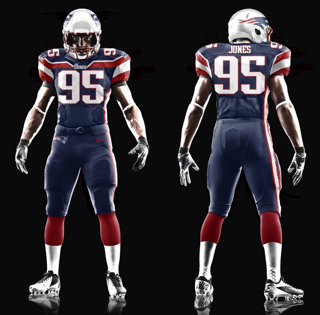
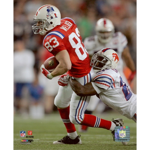
Why? the Flying Elvis has been very good to us.
I don't think it was because of the uniforms. Go with the old or go with the new, I don't want a merge of the two.