trevrox
Third String But Playing on Special Teams
- Joined
- Jul 29, 2015
- Messages
- 564
- Reaction score
- 504
I ordered a Patriots grill cover from Wal-Mart that I was very excited about. The picture showed that it was the old logo, the cursive font with the Flying Elvis over the P - my favorite. When it came in the mail and I opened it up I was pissed to see that it was this new ****ty logo we use now, NOT what I ordered. I was so pissed I returned it because it's so awful looking. I don't buy any Pats merchandise with this awful looking logo on it, and it's a shame now that they updated our jerseys this year to have that crappy looking thing on them.
I had a customer at work the other day who was wearing one of those really nice Nike Therma-fit sweatshirts with the old logo on the front. I asked him about it and where he bought it, head online when I get home to order one because it was really very nice looking. Sure enough they have all been updated and replaced with the new logo. I can't be alone in thinking that this new font is horrendous right?
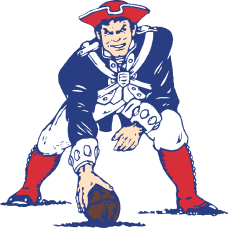
I know lots want Pat Patriot back but I grew up with the nice cursive font and I like it a lot. Most of my Pats stuff I own has that logo on it, there's just something about the way it looks... I really wish they would have never changed it. It's very hard to find a lot of the products I want (jackets, hoodies) because they are all ruined with the new logo. Even our end zones look awful now.
Am I alone in wishing the cursive font logo would return? Or am I alone in even caring this much?

Last edited:
